Shadcn Dashboard
For developers: Shadcn Dashboard provides production-ready UI components so you ship React apps without rebuilding dashboard foundations.
Built by Shadcn Dashboard · Developer Tools · Design Tools · Open Source · Freemium
In category: #702 of 971 · Developer Tools
Shadcn Dashboard is a Community listing on Launch Llama with 2 total upvotes, founded by Shadcn Dashboard who joined in Aug 2026, compared against 5 alternatives.
Community listing
Listing status
2upvotes
Community score
Shadcn Dashboard (Joined Aug 2026)
Founder
Compared against 5 alternatives
Market comparison
Launched on Launch Llama Aug 3, 2026 · #95 of 101 that day
About
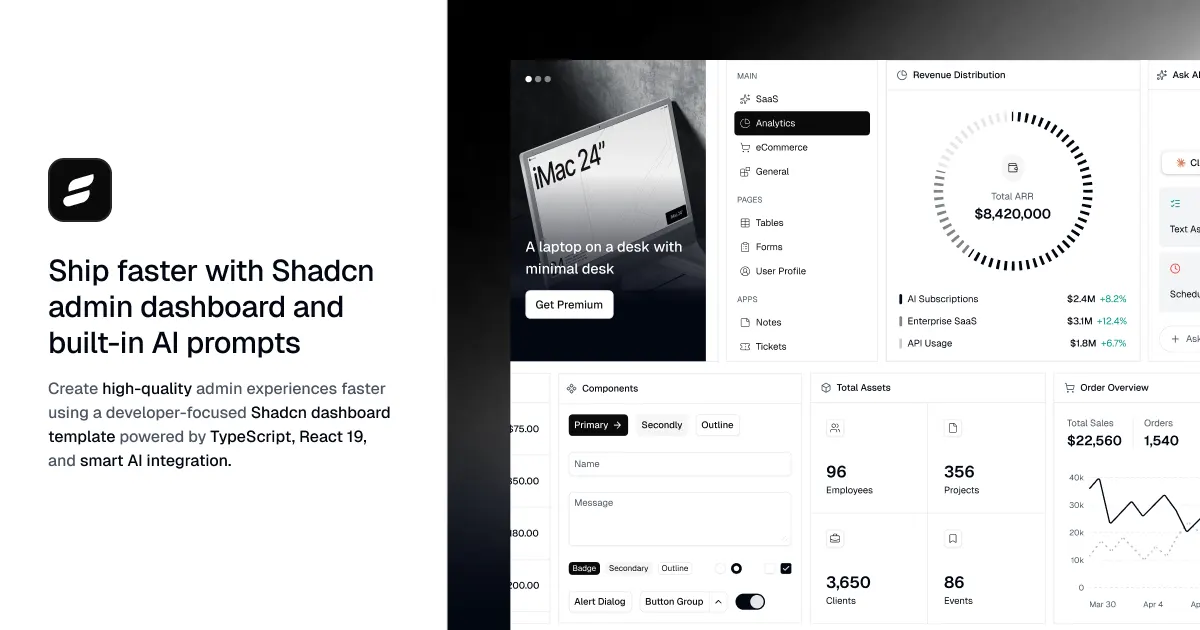
ShadcnDashboard.dev is a complete dashboard development platform built for developers who want to ship production-ready applications without spending weeks creating UI foundations. Instead of assembling dozens of libraries, fixing compatibility issues, and rebuilding common dashboard patterns, developers get a unified ecosystem designed for React, Next.js, TypeScript, Tailwind CSS, Base UI, and Supabase.
The platform includes reusable dashboard layouts, authentication pages, data tables, charts, forms, applications, settings pages, and hundreds of customizable UI components. Every block follows consistent design patterns, making it easy to extend existing interfaces or build entirely new products.
Unlike traditional UI kits, every component includes AI-ready prompts that work with ChatGPT, Claude, Cursor, and other coding assistants. The included MCP Server and CLI make installing and generating components significantly faster while keeping your project structure clean.
Developers also receive production-ready integrations including authentication, theming, animations, drag and drop, rich text editing, tables, charts, validation, and internationalization. Every feature is designed to reduce repetitive setup work and let teams focus on product development.
Built on Base UI primitives, every component is fully customizable without locking you into opinionated styling. Whether you're launching a SaaS product, internal admin panel, analytics dashboard, CRM, or enterprise application, ShadcnDashboard.dev provides a reliable starting point that scales with your project.
Use Cases
- Building the admin panel and dashboard screens of a React or Next.js app without rebuilding core UI foundations from scratch
- Generating matching shadcn-style UI components in Cursor, Claude, or ChatGPT by pasting ready-made component prompts
- Installing dashboard components with their dependencies and project setup via the Shadcn Dashboard CLI or MCP server
Who it is for
- Frontend developers building React, Next.js, or TanStack Start admin panels with Tailwind CSS
- Developers using AI coding assistants who want consistent, structured UI generation in their editor
- Small teams shipping production dashboards on Supabase-backed apps
Pricing
Get all access unlocks the full library of blocks, templates, and components.
FAQ
What is a ShadcnDashboard.dev?
ShadcnDashboard.dev is a complete admin dashboard kit built with Shadcn UI, Base UI, Tailwind CSS v4, Next.js, and React. It's designed to help developers build and ship beautiful admin panels faster. The kit includes reusable UI blocks, a comprehensive component library, pre-built application pages, and authentication flows, allowing you to go from zero to a fully functional admin panel in minutes. It also comes with a complete Figma design system for seamless design and development workflows.
Who is behind ShadcnDashboard.dev?
ShadcnDashboard.dev is proudly backed by WrapPixel, a trusted name in the admin dashboard ecosystem with over 15 years of experience building production-ready UI templates and component libraries. WrapPixel's products are used by 600K+ developers and agencies worldwide and are consistently rated 4.9/5 for quality, consistency, and developer experience. The portfolio includes AdminMart, ShadcnSpace, Tailwindadmin, and GetNextJSTemplates.
What kind of shadcn/ui blocks and dashboard components are included?
The registry includes pre-made UI blocks for dashboard layouts/shells, interactive chart sections (using Recharts), TanStack data tables, responsive sidebars, advanced forms, and auth layouts. It also contains standard components like cards, date pickers, command palettes, and custom animated elements, all optimized for Next.js, React, and Tailwind CSS. Layouts include Dark, Horizontal Navigation, Collapsible Sidebar, Mini Sidebar (compact view), and RTL (Right-to-Left). You can switch between them easily to suit your application's needs.
Can I install individual components and blocks, or do I have to use the full Next.js template?
You have complete flexibility. You can download the entire Next.js dashboard template to start a new project from scratch, or use our CLI (npx shadcn@latest add @shadcn-dashboard/[block-name]) to install individual blocks directly into your existing project. The CLI configures import paths and installs necessary dependencies automatically.
Which authentication providers are supported?
Supabase Auth, Clerk, NextAuth (Auth.js) Authentication are supported with ready-to-use integrations and examples. You can choose the provider that fits your stack and switch between them easily.
Are the charts and data tables production-ready or just design mockups?
Both charts and data tables are production-ready. Charts are built with Recharts and are fully interactive with real data binding. Data tables use TanStack Table with sorting, filtering, and pagination built in, not static mockups.
How does the AI integration (MCP Server) work with editors like Cursor or Claude Code?
We provide a custom Model Context Protocol (MCP) server that indexes our entire component registry. When connected to AI editors like Cursor, Claude Code, or Windsurf, the AI assistant understands your layout, components, and Tailwind styles in real time. This means the AI can generate and modify code that matches your existing setup perfectly, without you having to manually copy-paste context.
Can I customize the design system beyond the included color themes?
Yes. The design system is built on CSS variables and Tailwind configuration, so you can modify colors, typography, spacing, and radius values globally. You can also create entirely new themes or extend the existing ones without touching individual component files.
Can I change design styles between Lyra and other presets?
Yes! The dashboard comes with a built-in Style Switcher supporting presets like Lyra, Nova, Maia, Mira, Luma, Vega, and Rhea. Switching presets dynamically changes the border radius, shadows, borders, and overall aesthetics.
Do I get the Figma design files?
The Pro Figma Kit is included with the Pro, Teams, and Enterprise plans. It is not included with the Free plan.
Alternatives
 Shadcn ExamplesFor developers: Shadcn Examples provides copy-paste React and Tailwind UI kits, dashboards, and component blocks built on shadcn/ui primitives.
 Shadcn SpaceFor developers and designers: Shadcn Space provides premium UI components, blocks, and templates built on Shadcn UI—ship polished interfaces faster with animations and clean code.
 TailwindadminFor web developers: Tailwindadmin provides ready-to-use Tailwind CSS dashboard components so you ship admin panels in hours instead of days.
New on Launch Llama
- WatermarkRemover VIP
- The Forge Calculator
- Pre-Med Coach by IMA
- Image to Text Online Free
- HEIC to JPG Converter
- Skyelight
- N8N Chat UI
- Canva Brush
Launched this week · This month's launches · All products A–Z
Ask AI about Shadcn Dashboard
Supporters
1 founder
1 founder supported Shadcn Dashboard on Launch Llama.
For bots & AI agents
Machine-readable versions of Shadcn Dashboard and Launch Llama. Fetch these instead of parsing this page.
This listing (.md) llms.txt llms-full.txt ai.txt Full catalog (.md) Endpoint index API docs MCP server MCP manifest Developer docs